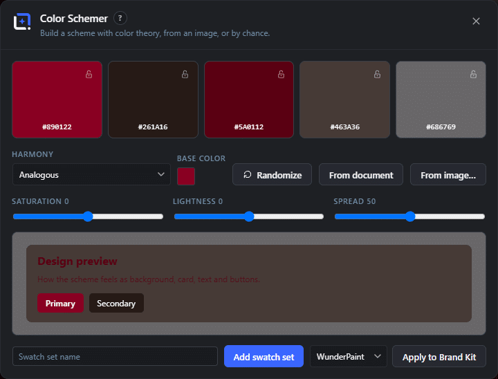
Choosing colors is the part of design where people either freeze or reach for a random generator and hope. Both are avoidable, because color harmony is geometry: pick a hue, and the colors that work with it sit at predictable angles around the wheel.
Color Schemer does that geometry for you and then does the boring part too. Give it a starting color, or let it read the colors already in your document or out of an image, and it proposes palettes built on the seven classic harmonies: analogous, complementary, split complementary, triadic, tetradic, monochromatic, and shades and tints.
The bit that saves real time is what happens next. Apply a palette and the whole document is recolored, not just a swatch panel updated. Every shape, every text layer, every fill follows the new scheme at once, so trying five palettes on a finished design costs five clicks rather than an afternoon.
And when one of them is right, push it straight into a brand kit. From then on those colors sit in every color picker on the site, in every template, in every generated image, so the decision is made once and stays made.